When approaching our new identity, we made a conscious effort to reflect less on our immediate surroundings and traditional inspirations, and more on the bigger ideas that now drive how we develop modern, technologically capable, teams. There is a place called Goodland for sure, but we’re about bringing good to wherever we are going, not spreading Goodland to other places we soon may be. We’re preparing good teams, even great ones, wherever we stand.
We’re also reverent about the agricultural or rural heritage from whence we are founded, but just as importantly, we seek to emphasize people, not place. And on doing good for our students, our communities, and our customers.
Having a symbol as part of our brand provides us with a transportive element; a graphic, that when imbued with meaning, acts as a visual shorthand for what we’re about. A symbol allows our brand to speak volumes without words, to scale without compromise, and create associations to our brand with fewer impediments.
The visual ideation around our symbol began with one aspirational phrase: path to possible—the verbal shorthand to what we’re all about.
One idea, centuries-old, is a people-scaled path, in the construct of a hedge maze— a horticultural challenge designed with an inherent goal. A bit of a nod to the Agri-heritage of our pre-technology, agricultural communities. In addition to that idea is a more modern one: the silicon chip. A microscopic maze of another sort, containing a set of electronic circuits and gates, for complex digital processing—reflecting our current technological focus and acumen. 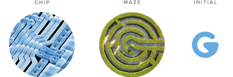
A path, inherent in the hedge maze [as metaphor for rural roots] and the silicon chip [technology managing data flow], both suggest that direction and solutions are the ultimate objective. Or the path to possible. Added to these ideas are the graphical encircling C (for community), and initial G (for Goodland Tech) at the core. And lastly, a reference to a single bit of data within the symbol is very much at the center of our vision of contributing to the building of the crypto economy, Web 3.0, and emerging technologies.
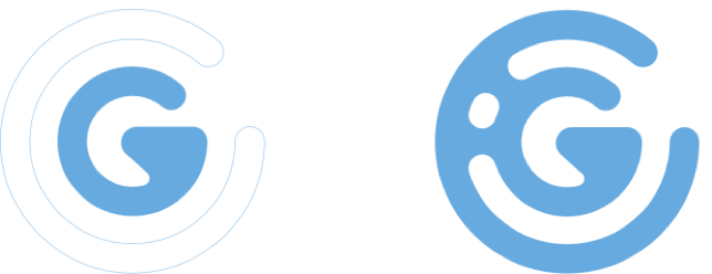
This amalgamation of visual thinking and graphic design articulation forms a symbol that acts to speak to our advanced technology offering positioned within the heart of communities—where wellsprings of talent call home and seek new opportunities.
No simple graphic says it all, so we have lots of communicating to do over the next months and years, overall media, and touchpoints. But over time a symbol can represent us all. We’ll use it on all our communications and wear it proudly as evangelists for the Goodland Tech brand.
Those who are inspired can now realize their path to future success. Together, our brand identity—including symbol, expression, and messages—are the beacons that lead to that path.
Ben and Richard
